使用纯css实现三角形,主要用到的属性是“border”和颜色值“transparent”(表示颜色透明)。
border:用于设置盒子模型的边框;
transparent:表示颜色是透明的。
通过一个例子说明,代码如下:
<!DOCTYPE html PUBLIC "-//W3C//DTD XHTML 1.0 Transitional//EN" "http://www.w3.org/TR/xhtml1/DTD/xhtml1-transitional.dtd">
<html xmlns="http://www.w3.org/1999/xhtml">
<head>
<meta http-equiv="Content-Type" content="text/html; charset=utf-8" />
<title>纯css实现三角形例子</title>
<style>
*{ margin:0; padding:0; list-style:none}
body{ background:#E6F0F3;}

.triangle{
	width:0px;
	height:0px;
	border-bottom:50px solid red;
	border-left:50px solid transparent;
	border-right:50px solid transparent;
	position:absolute;
	left:100px;
	top:100px;
}

</style>
</head>
<body>
<!--代码部分begin-->
<h1>纯css实现三角形例子</h1>
<div class="triangle"></div>
<!--代码部分end-->
</body>
</html>
运行结果:
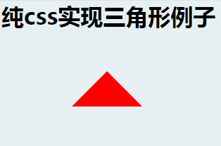
核心代码:
width:0px;
height:0px;
border-bottom:50px solid red;
border-left:50px solid transparent;
border-right:50px solid transparent; 通过“width”属性可以将三角形变为梯形,当“width”的值是0px时,形状是三角形;当“width”大于0就变成梯形。
有一点需要注意的是:border-bottom、border-top、border-left、border-right四个属性,需要选择三个设置,选择不同的属性图形的方向不一样。可以参考在线案例:纯css实现三角形
木庄网络博客(2016/10/28 11:41:03)
不错的网站主题,看着相当舒服